Lab 1 - Website Inspiration
By Michael Quinn and Kira
Challenge
The challenge is to work together with a partner to virtually to select, analyze, and dissect the interactive features of three websites.
Problems
There weren't any particular problems. However, we spent time to document and analyze the features and guessed how they might have been implemented.
Reflection
For our first lab project, the two of us worked together virtually to select, analyze, and dissect the interactive features of three websites. By communicating through Discord calls, screen-sharing, and discussion, we were able to simultaneously work on the project together. We looked at the different sites that were listed in the project description and analyzed various award-winning interactive features presented by the websites. After our original analysis, we chose three websites to further investigate their interactive features. We documented and analyzed the features and guessed how they might have been implemented. Throughout the project, we combined our efforts in order to complete the project.
Results
Here is a video of one of the interactive elements of an inspiring website. The key feature is coloring in various characters and their environments, similar to a drawing program. (https://www.woset.world/play/)
A video of a soccer goal visualized by a series of spiraling lines, dots, and colours. The animation is aggressive and the colors are bold. (https://fever.acervo.studio/goal/16-G-BRA-x-SRB-BRA-73-Richarlison)

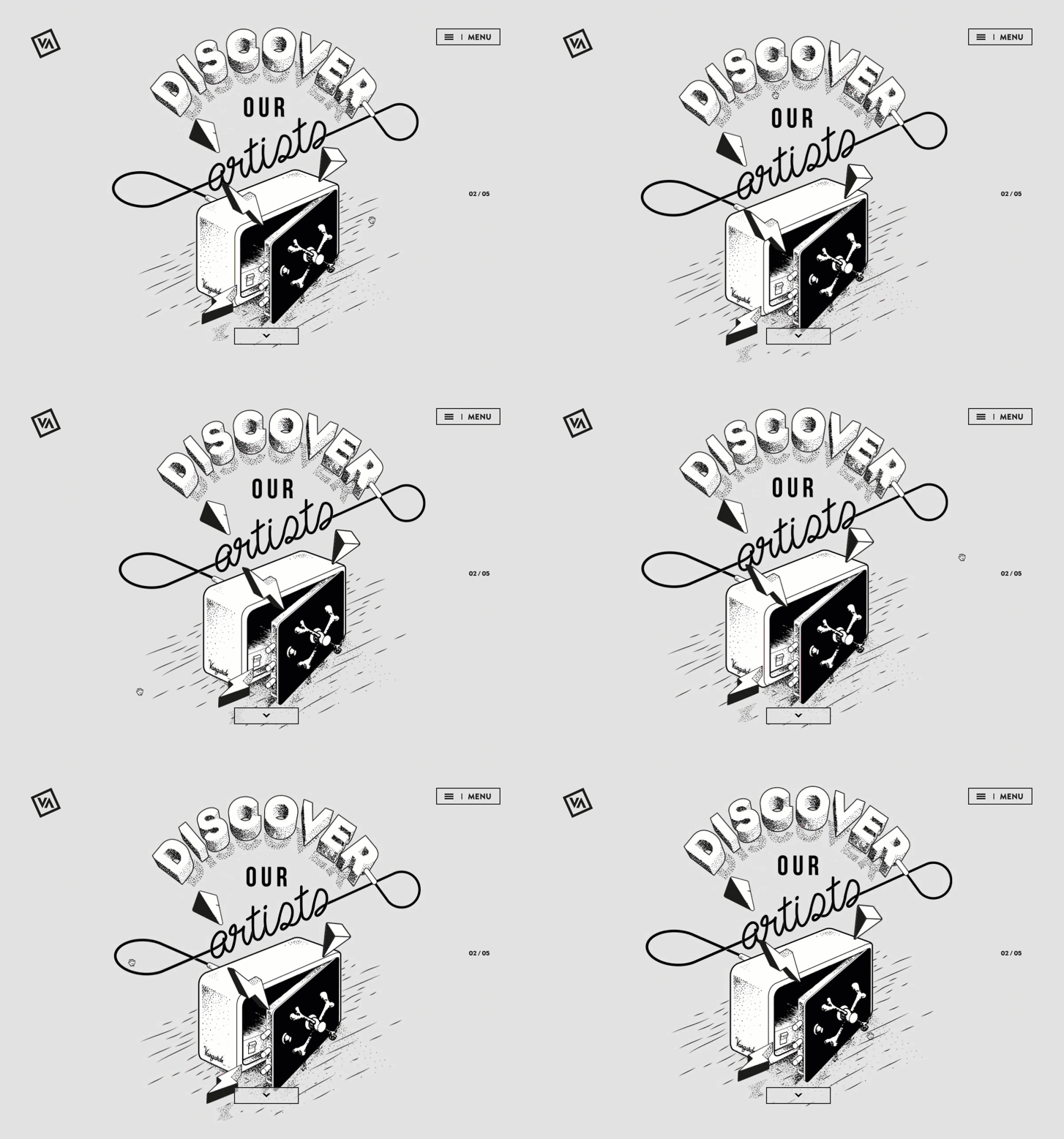
A screenshot of a drawn safe surrounded by lightning and pyramids. On the webpage, both the safe and the auxiliary elements follow the mouse, with the lightning and pyramids moving faster than the safe. This provides a sense of depth to the image. (https://www.vangardemusic.com/)

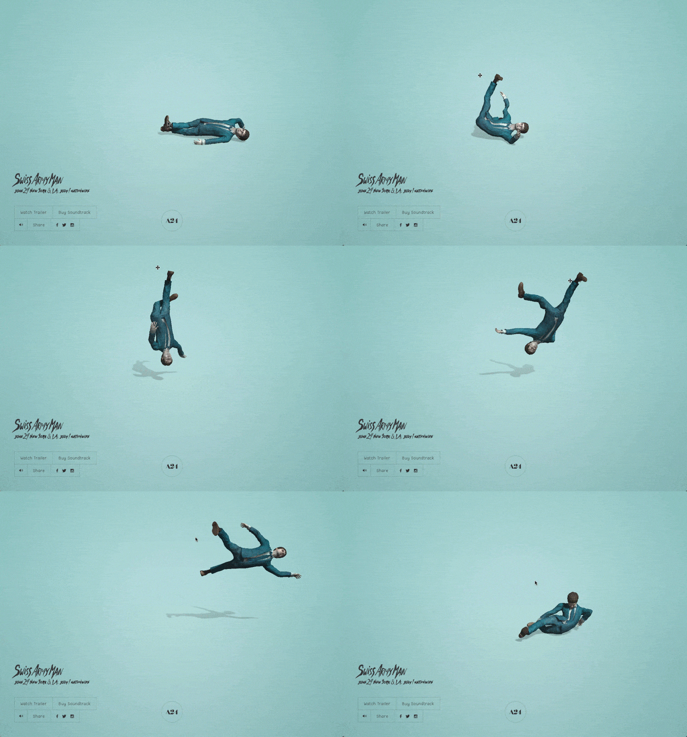
This is an extra gif that inspired my partner and I. We loved the quirky ragdoll physics of the man and it reminded us of silly games like Octodad and Goat Simulator.
| Website | Description |
|---|---|
| Woset.world | We liked the interactivity and the capacity for expression that the feature provides. It may work by stamping down circles of pixels. There are likely separate layers for the black lineart and the canvas you color on, allowing you to draw beneath the lineart. |
| Fever.acervo.studio | We were inspired by this feature since it was both familiar and striking, similar to a computer screensaver but with energetic colors and bold movement. It seems to have been implemented by using a sequence of animations. This can be achieved by having the rendered animations stored as .gif files and playing the files in series. |
| Vangardemusic.com | We liked the depth the visual effect gave to the flat images. I believe the effect is created by taking the mouse’s horizontal and vertical position and feeding each number into two different functions: One function controls the safe’s position while the other controls the lightning’s and pyramid’s position. The function controlling the safe is set up to move less, creating a sense of depth. |